
3 Ways to Check Your Website's Mobile Responsiveness
Make Sure Your User Experience is Responsive Across All Devices- Especially Mobile!
In today’s world of smartphones, tablets, and laptops – it’s more important than ever to have a website that is completely mobile responsive. If you are unfamiliar with what mobile responsive means, let’s give you a little refresher. Mobile responsiveness means that your website is designed in a way that certain elements such as imagery and text will adjust based on the device that is being used. If you want to read more about how a mobile responsive website can affect your user experience, check out one of our recent blogs here. Ensuring that your website is mobile responsive can make the biggest difference when it comes to your user experience – so how can you check your own website’s mobile responsiveness?
Browserstack.com
The browser stack is a great tool to check the responsiveness of your website – and it’s one of our favorites here at Spectrum Net Designs! It allows you to toggle through tons of various devices to actually see what your website page will look like on any specific device. Browser stack does require you to set up a free account with them in order to utilize their mobile responsive testing – but it’s super simple and easy, just input the URL that you want to analyze and let Browser Stack do the rest.
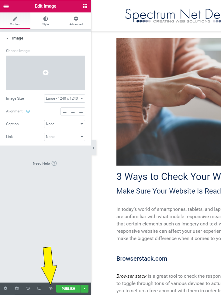
Within Your Website Editor
If you use a simple drag-and-drop editor for your website pages such as Elementor (used with WordPress) then there is a simple way to check your mobile responsiveness. In the bottom left-hand corner, you can adjust your view between desktop, tablet, and mobile. These views allow you to make element adjustments in specific views of your web page. For example – if you view your page in mobile view and decide that you’d like your text center aligned in mobile but left aligned in desktop, you can easily make that change. If you’re just looking to check your mobile responsiveness, then those views are also a great way to see your pages individually. Check into whatever website provider you use to see what options there are for checking your website’s responsiveness.
ResponsiveDesignChecker.com
Responsive design checker is another simple tool to see your individual URLs in all of your desktop, laptop, tablet, and mobile options. The great thing about responsivedesignchecker.com is that you can also put in any custom width or height size to see what your page would look like on a specific sized device as needed.
As you can see, there are many very helpful and even free tools out there to help you check your website’s responsiveness, so don’t settle for a website that doesn’t give your users the absolute best experience. If mobile responsiveness isn’t something you’ve ever really considered or maybe you need help attending to it – contact us today. We are happy to help you learn more!
Want to get started with your website analysis?
If you enjoyed this article, please share it with your friends!
Connect With Us